Showing posts with label still life. Show all posts

Tuesday, 31 December 2013

Art Review 2013

Happy New Year!

Looking back and reflecting has always been part of my way seeing through the transition of one year into the next.  Rather boldly and publicly, on this blog, I outlined 6 New Year Resolutions at the beginning of 2013.  Now I have to review whether any of them came to fruition!

1. Work smaller scale -  my work generally has been on a smaller, manageable scale.  However, I did also toy with the idea of a series of very small paintings based on local landscapes around my village, but have not done a single one!
2.  Work more from life - I have definitely done more work from life this past year.  Paintings have tended to be connected with the classes, but sketchbook work has increased greatly.  Making use of those small allocations of time creatively has helped me stay connected with my personal inner artist as well as honing skills and observation.


Bird studies - observing through the kitchen window.

3.  Close Inspection, initiate a series of work based on close up textural surfaces - this has not got off the ground, although I have continued to photograph areas of abstracted texture.  Maybe the answer is to set up a Flickr account and keep them just as a photographic series?
4.  Seasonal, initiate a series of work based on still life fruit and vegetables - this has not really spilled over into my personal work, although it has remained part of the class programmes and is an element I always enjoy.


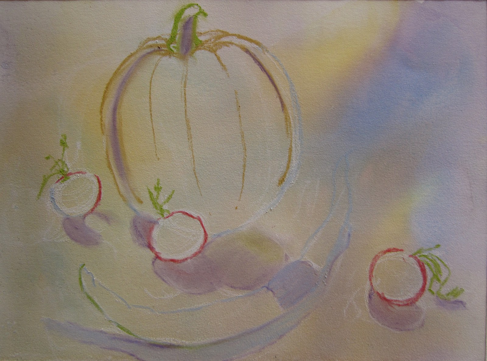
Winter squash painted in sketchbook, couldn't resist the colouring...

5.  Act on opportunities and interests, don't put things off - this aspect is an ongoing work in progress.  I am definitely an 'ideas person' and generate so many, not all of them practical, that sometimes I need a bit of time to pass to assess which are viable.  I have found it really helpful to write down ideas in a notebook, and have even ticked off a few from the previous year.  In 2013 I finally entered the Eastern Open Exhibition and despite not having anything selected really enjoyed the work I did make for it.  I organised a bag for doing sketchbook work when away on holiday - France was more successful than Rome.  I treated myself to a camcorder, filmed work in progress, and set up my YouTube channel.  In November I took on the role of membership secretary for the West Norfolk Artists Association and have already had an article published in Update (the monthly newsletter) titled 'Making the most of Your Membership'.

I feel this resolution has been instrumental in making me have a more proactive outlook.  (Plus it will have repercussions into 2014 - more on that in my next post).


Camcorder set up - ready for action!

6.  Website - I periodically tried to get my original website on track.  However, images of my work have sailed off into the wide blue yonder and the whole thing does not seem very 'user friendly'.  In the autumn I signed up to Weebly and have been slowly building a free website, and have a fair amount of pages / galleries done but it is not yet 'published'.  I wonder if I am trying to be too ambitious, too soon.  This website will showcase all the media and genres I incorporate into my artistic life.  I would also like to organize a 'shop' but that may have to come later - better to go 'live' and see how it operates in public first.

So, some successes and inevitably a few non-starters.  Why not 100% success?  With hindsight I was probably over ambitious in my expectations, but human nature plays a big part.  I am sure many of us make resolutions and most of them will have fallen, been broken or completely fail to get off the ground before January has even passed.

Did you make any resolutions in 2013?  Try a review - and then make some more for 2014!!!

Happy New Year! 

Monday, 16 December 2013

Fun with Pen and Wash

Winter Heather and Statue, 32 x 24cms
Edding permanent pen and watercolour
on Fabriano 5 HP watercolour paper. 

I think the most popular media this Autumn Term, in the Mixed Media Class, was using pen and wash.  I planned two sessions - one either side of the half term break.  The first was using a permanent pen, which leaves a fairly uniform line even when using a 0.7mm.  The second session I introduced a dip pen and Indian ink which enables flowing calligraphic lines, and a more hit-and-miss approach.  I find the loss of precise control can lead to bolder, fresher work.  Whichever method, many people like to start with a simple pencil drawing to establish the composition, it gives confidence when starting with the pen as it cannot be erased - so any mistakes have to be incorporated and lived with! I suggest setting off with a bit of urgency when first going over the pencil lines in pen, working too slowly and deliberately can produce a very static line.  People are often surprised at how they unconsciously go on to embroider more details once they get going, and with surprising confidence. At any point the pencil lines can be erased to leave a clean pen image before introducing passages of watercolour.

The subject was quite open in that I suggested 'holiday' as a theme for exploration.  This could range from the broad holiday view of a scene captured on camera as a memory, to a close up detail of something of interest.  The example I worked up for the session (I usually photograph the stages and print off to show the progression) shows a weathered stone statue from a winter walk last year, the heather framed it so beautifully.  The cropped close up view below shows how I had to think about what sort of marks could be used to portray the various textures.


View close up - variety of marks to describe various textures.

For the session using the dip pens and Indian ink I chose to incorporate working from still life.  As an added interest I suggested looking at the illustrations used to advertise Worzals, a local garden centre/farm shop/cafe.

Adverts for Worzals Farm Shop.

Studying these illustrations closely showed not only the beautiful quality of line but also that some printing had been done using actual leaves etc.  A marvellous opportunity to have a go at another approach...


Calligraphic lines using a dip pen and Indian ink,
plus some leaves of the purple sprouting broccoli painted with ink
and used to print on Fabriano 5 HP watercolour paper. 

Ink painted onto head of purple sprouting broccoli
before used to print texture on the paper.

All very hit-and-miss,
loose lines added to enhance leaf prints, ink blots welcomed!

Watercolour washes added - free approach kept going
with paint not restricted by line and more spatter.

I also had fun with a second offering,  I couldn't resist these beetroot when I went shopping.  I think my enjoyment of the subject matter and treatment shows in the work itself!


No pencil drawing this time - straight in with the dip pen.
Beetroot cut in half to make print bottom left.  Brush also used to add ink as shadows. 

Watercolour washes added.

The feedback from the sessions was very encouraging and in the final session of term, when members can work on something of their own choice (or finish off work from previous weeks), many opted to have another go using one of these methods.

I also had another stint using the dip pen recently, this time with Quink Ink.  When diluted with water this ink tends to separate out into blues, greys and ochre - all by itself!  It is perfect for using in sketchbooks, but be aware that it is not very lightfast.

Studies of natural objects with dip pen and Quink Ink. 


Saturday, 9 February 2013

Painting still life - Clementines in Acrylic

Classes this week have been very enjoyable.  Every term I like to include a session working from life and the mixed media group were asked to bring fruit or veg to set up a simple still life.  I had specified acrylic as the media to work in, and encouraged members to try small canvas boards which are lovely to paint on.  I had painted an example myself and photographed the stages as a suggested method of working...

Stage 1: Create mid-tone and sketch composition

Backgrounds can be a problem with still life, so I advised painting a diluted acrylic wash of colour over the whole board to create a mid-tone (and to get rid of the 'scary' white canvas).  This is a preliminary layer but can be left to play a major or minor role later...  Once the wash has dried sketch out the composition, either with pencil, pastel, or directly with diluted paint and a brush.

Stage 2:  Block in base colours

Block in the basic colours of the subject - go for generalised light, mid, dark tones to start to suggest the form.  Cast shadows are important, get them in early!  They are part of the design process and can be used to create drama, interesting shapes and / or can act as a linking device.

Stage 3:  Scumble background colour

I find people often set off painting the objects to a high degree of finish, sit back and then think "oh, what shall I do with the background?"  In the class situation there isn't room to create elaborate 'sets' with draped fabric for each individual still life arrangement.  Backgrounds are really being invented.  For this next stage I suggested they might like to try scumbling a paler, thicker paint mix over the mid-tone background to create some interest and texture whilst keeping it simple.  I like to use a big flat brush for this and use my brushstrokes in an almost criss-cross fashion allowing some of the first wash to show through .  I paint right up to the objects and around the cast shadows.  Apologies for the cool tint of the photograph, it was getting dark and I forgot to take another picture before carrying on work the next day.

Stage 4:  Bring the painting to life with subtle colour, tones and detail

This is the bit everyone enjoys - working with a wider range of colours and tones and gradually adding detail to bring the painting to life.

Clementines, acrylic on canvas board, 8 x 10 cms

I really enjoyed working on this little painting in acrylic.  The warm limited colour palette is certainly uplifting on a chilly February day.  I find the orange / purple colourings exciting and more pleasing to the eye than a true complementary pairing of orange / blue.  In fact with the addition of the green in the leaf this colour combination is known as a triadic colour harmony.

If you have never tried painting from life, look for some fruit or vegetables in the fridge (or next time you're in the supermarket treat yourself to something you would like to paint) and have a go.

Wednesday, 12 December 2012

Still Here - Still Life: Step-by-Step

Yes, I am still here - alive and kicking.  I recall reading once that many blogs fail in the first six months.  I also remember thinking 'that won't be me'.  And look what happened...  However I am determined to redeem myself, and post consistently from now on.  So I plan to update this blog once a week, if not more.  This means I need to be more productive with my time and create more artwork to reflect upon.  As the year draws to a close I will be looking back at the highlights and planning for the new year ahead.  One aim is to draw and paint more from life and so to kick start my blog I offer a step-by-step for a seasonal still life.  This was a demonstration piece for a pastel class in the Autumn.

Materials:  White Art Spectrum paper.
                  Watercolour paints and big brush.
                  Pastel pencils.
                  Pastel sticks.
                  Viewfinder.     
                  Selection of seasonal vegetables.


Tape paper to board along all 4 sides.

1.  Set up simple still life.  Use viewfinder to decide composition?
  • Consider size, shape, colour, light source, shadows, negative space.
  • Ways to connect elements - overlap, use of cast shadows.

Watercolour underpainting

2.  Look at colours in arrangement - use 2 or 3 for non-specific background.
  • Mix colours as separate large puddles (not too weak).
  • Test/review colours.
3.  Create variegated background (use big brush).  Dry.


Draw with pastel pencil

4.  Draw composition with pastel pencil.  Check with viewfinder?


Blocking in
 
5. Use pastel sticks / pencils and start working bigger areas.
  • Half close eyes to get 'gist'.
  • Softly block in shadow areas first, including cast shadows.
  • Indicate lightest areas.
  • Darken background behind light areas to set them off.
  • Ensure some of underpainting shows.

Develop work

6.  Continue to develop work with pastel sticks / pencils looking at more subtle passages.

7.  Assess, make adjustments as necessary.


Seasonal Bounty, watercolour and pastel